The development of the OPAC interfaces from the 80s until today – trends, challenges and UX
Ever since the Internet came into our lives the OPAC interfaces have gone through many changes, requiring rapid evolving and adaptation, depending on the renewed- technology setting and the changing consumers’ demands.
It is customary to divide the development of the online public catalog (OPAC) into four main phases, depending on the stages in which the user interfaces have changed, and thus altered the image of public libraries.
1990-1997 – How it all began: the advent of the first computerized public libraries.
At that time the systems were DOS based, and available only to users in the library. The user interface was only textual, providing inventory and was largely software-oriented – not user, requiring familiarity with the functions and codes needed to get the desired information. For these reasons, the systems were not at all relevant to the end users.
Towards the end of this phase, the Internet began to enter our lives and libraries have begun to acclimatize from old systems (DOS) to the Internet network.
1997-2000 – The Internet is starting to take its toll and the first search interface become available to users outside the library.
The interface is still mostly textual, but for the first time you can find basic graphic aspects and focus more on “the information needs” of users, and less on the presentation of inventory. 
2000-2010 -The first decade of the 21st century – is characterized by an emphasis on the information needs of users. The user interfaces allow a much wider set of actions and there is a strong emphasis on usability and independent actions of end users, not just system administrators.
In addition, there is a search strategy first used by the user (Boolean searches), cross-checking the information from various databases, and more.
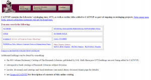
(Online catalog of Delhi Public Library 2002)
Furthermore, in the first decade of the 21st century, we have witnessed the beginning of the Web 2.0 revolution: sharing of information by the public and accordingly the first aspects of interactivity – one of the main features that accompany the development of interfaces from that point to the present.
Interactivity is the medium ability to change and be shaped in accordance with the user needs and to establish a dialogue.
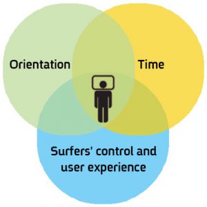
From the user’s perspective there are three parameters to measure the interactivity of the site:
A. Orientation: whether the communication in the site is linear only or enables response capabilities and messaging, both between the user and the site and the users themselves – reviews, recommendations, comments, sharing and so on.
- Surfers’ control and user experience: how much independence does the site offer to the user? This of course depends on the viewers’ ability to shift freely between content and site sections dynamically, independently and continuously.
- Time: In terms of site responsiveness – Is it fast? Is there high performance capability?
2010-? Accessibility and information for all: The main characteristic of this period is the accessibility and availability of information anywhere, anytime and to anyone. Both new audiences who previously have not been part of the discourse on the Internet, such as those with special needs, and the development of cross-platform interfaces that are accessible in a variety of devices, such as tablet, mobile, big screens and more.
In conclusion, in the last 20 years the OPAC interfaces have gone from functional designing to visual designing: shifting from text-based interfaces, efficient but essentially technical, to visual interfaces providing a complete user experience, where the need for text-based communication decreases.
From passivity to involvement: shifting from interfaces where users were passive viewers without any control, to user interfaces that are largely controlled by the user and allow him to roam independently and work according to his needs – entering orders, performing loans extensions, searches, saving search queries etc.
From syntax to semantics: Since nowadays there is a very high degree of visual communication interfaces, and processes are represented in graphical icons, the user can activate the interface intuitively, while experimenting freely, because he understands the meaning (semantics) and the process, without having to read the instructions and remembering commands (syntax) that were previously necessary in operating interfaces. From “All in good time” to “Everything is open”: In the past, each library had its own search interface offering access to its materials, now the trend is to offer users an interface that allows searches in a variety of data sources simultaneously, including references to other sources of information.
From general support to specific contextual support: shifting from insufficient feedback to the users’ actions, to interfaces that are accessible where the system is able to analyze the specific user needs (according to his personal profile, or by its searching operations) and provide him with feedback relevant to the unique problem or action which he performed.
From UI to UX – if in the past it was clear that there had to be a “user interface” (UI) that exposes the information to the general public, today the interface must also provide “user experience” and offer added value to users who visit the library site.
After listing all the challenges with which we have dealt so far, let us review the challenges at our doorstep today and in the near future:
Support of a variety of devices and adaptation to different resolutions – the browsing experience should be the same regardless of the device / browser that is running the site – mobile, tablet, computer screens and others. So the OPAC must be available in the variety of these devices.
Accessibility standards – exposing library to new variety of audiences with special needs requires adjustment of interfaces to the needs of these audiences.
Multiplicity and variety of users – the Internet that has penetrated everywhere and has information available to everyone, requires among other things the adaptation of OPAC to a variety of countries, languages, needs, ages and abilities. Today you can already find in some of the sites the option of filtering search results by countries and by languages and the ability to view items in accordance with the user’s language. For example, the “Europeana Collections” site and public libraries of New York and Berlin.
Requirements of end-users for sites efficiency: End users require fast performance, availability of information anytime, anywhere, and high functionality that will allow the user maximum independence.
Visual – the visual replaced the written word – Facebook, Instagram and other platforms are already an integral part of our lives, and it is only natural that we will see this trend in the OPAC. And indeed, the catalogs of the world’s leading public libraries have already adapted themselves to the visual era (Library of Congress, the British Library, Boston, Berlin, New York, etc.) and in the near future many other libraries will join them. The visual is already manifested when entering interfaces, search screens are reduced to simple search bars, the search results are not just textual and include images, and icons replace text and more.
UX “user experience” – one of the “hottest” issues today in most public and academic libraries is the “User Experience”. The UX – includes all aspects of user interaction with the application/site (in our case, the online catalog of the library).
A properly designed user interface directly affects the user’s experience, since it provides end users with the best tools to achieve their goal from the site and thereby increase their experience and increase the efficiency and the user’s satisfaction from the site.
How can the UX be manifested in the OPAC? Here are the three main principles:
- Fast navigation: intuitive design of the interface allows the user to quickly understand what is in front of him and what he has to do to get the information he needs. In addition, the design must be action-oriented, that is to display only the relevant options to the next step. The navigation is simple and clear and thus allows getting faster results.
- Coincidence: recommendations, navigation routes and intuitive surfing, leading to accidental discovery of relevant resources that help users expand the scope of their study and learning of a specific topic on the site, thereby deepening their understanding and learning of the subject. A Popular way of discovering random information is by following recommendations that allow users to benefit from choices made by other users, expand the use of the site and benefit from it.
- Customization: search results tailored to the user’s personal profile and preferences are the best results for the user’s query. Google, Amazon and many others have taught users to get information and services that are just right for their individual needs. The library catalog must join this trend and make users feel that the site has been optimized for them. For example by pointing to the best results for a particular query, displaying options for action based on a personal profile or previous selections and even according to the user’s location.
How we’ve applied these principles in the new Idea catalog and more, in our next post.


